

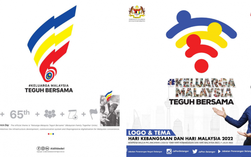
On 1st July 2022, Malaysians got their first glimpse of what will be the latest logo introduced as part of the upcoming 65th National Day celebrations in the country. Much to everyone’s surprise, the new logo bears a striking similarity to the logo used to represent WiFi reception.
65th National Day logo launched
Well apparently, those similarities did not come about by coincidence as according to an infographic published by national news agency BERNAMA, the rationale behind the 65th National Day logo had been meant to represent a new generation of mobile infrastructure and connectivity in Malaysia.
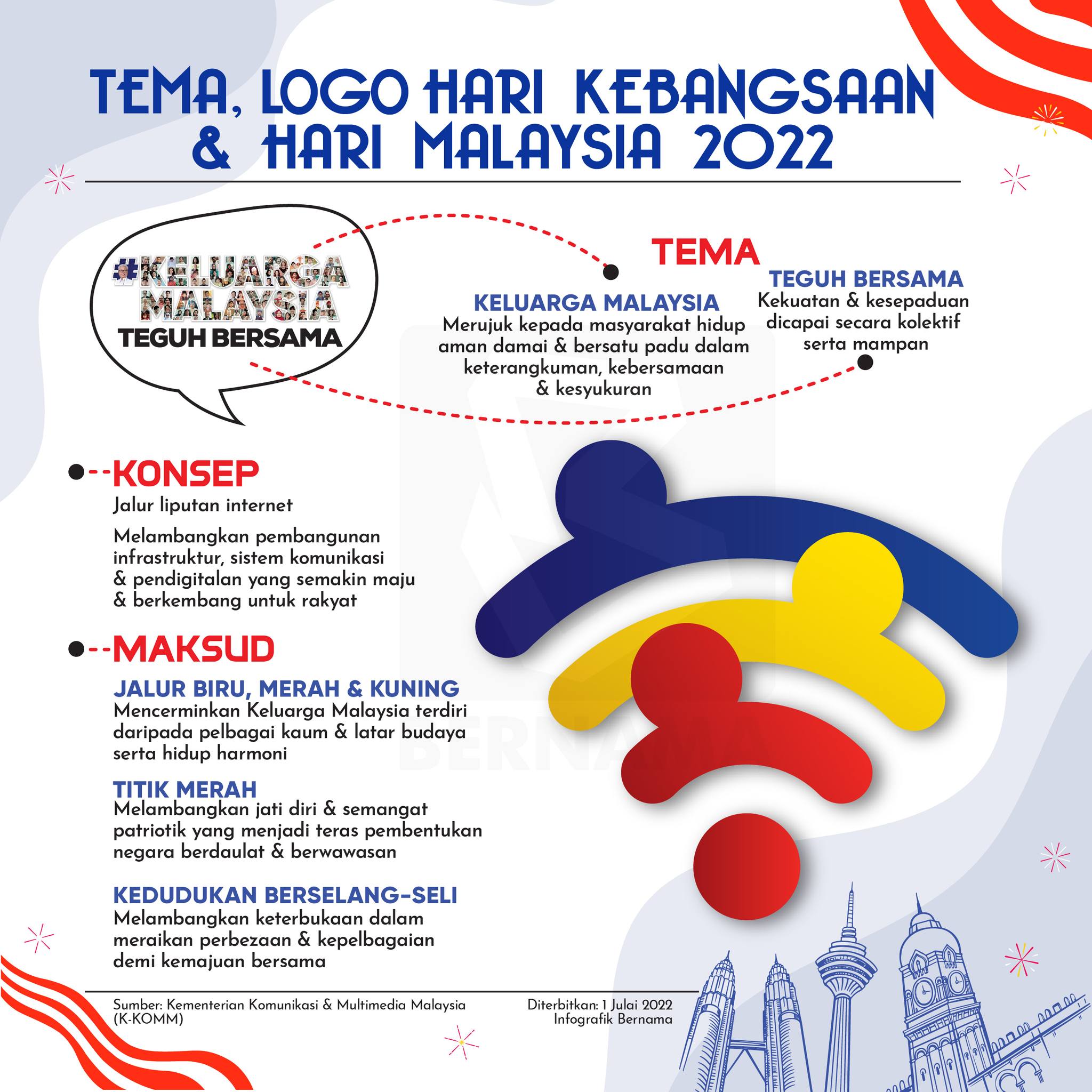
This is likely owing to the recent successful launch of the MEASAT-3d satellite on 22nd June 2022, which seeks to address geographical gaps in the country’s 4G and 5G connectivity, according to Business Today. Then of course, red, blue and yellow were deliberately chosen to mirror the colours of the national flag, and ‘denote the country living in harmony’.
Reception has been mixed, with many Malaysians criticising the seemingly slapdash effort to create a new logo. Others have gone on to say that there isn’t a point to using the WiFi logo as a motif to represent enhanced connectivity among Malaysians, when so many in the country still face difficulties accessing the Internet.
“The three bars are used to indicate that this is as far as how strong the country’s Internet connectivity goes. (We’re supposed to receive four bars anyway.)”
“Did a Form 1 student design this? Just asking.”
“Talk about using WiFi as a logo. My workplace still uses 3G, which sometimes works, sometimes doesn’t, for 26 years running.”
Netizen offers a redesigned look
Which is why one Malaysian netizen has taken upon himself to offer a redesigned version of the logo that still sticks close to the intended rationale. As shared by De Del on his Facebook page, his proposed redesign fuses elements from Malaysia’s history, including Tunku Abdul Rahman’s independence speech, the curled end of a scroll, as well as the colours of the Jalur Gemilang and the shape of a traditional tengkolok headpiece.
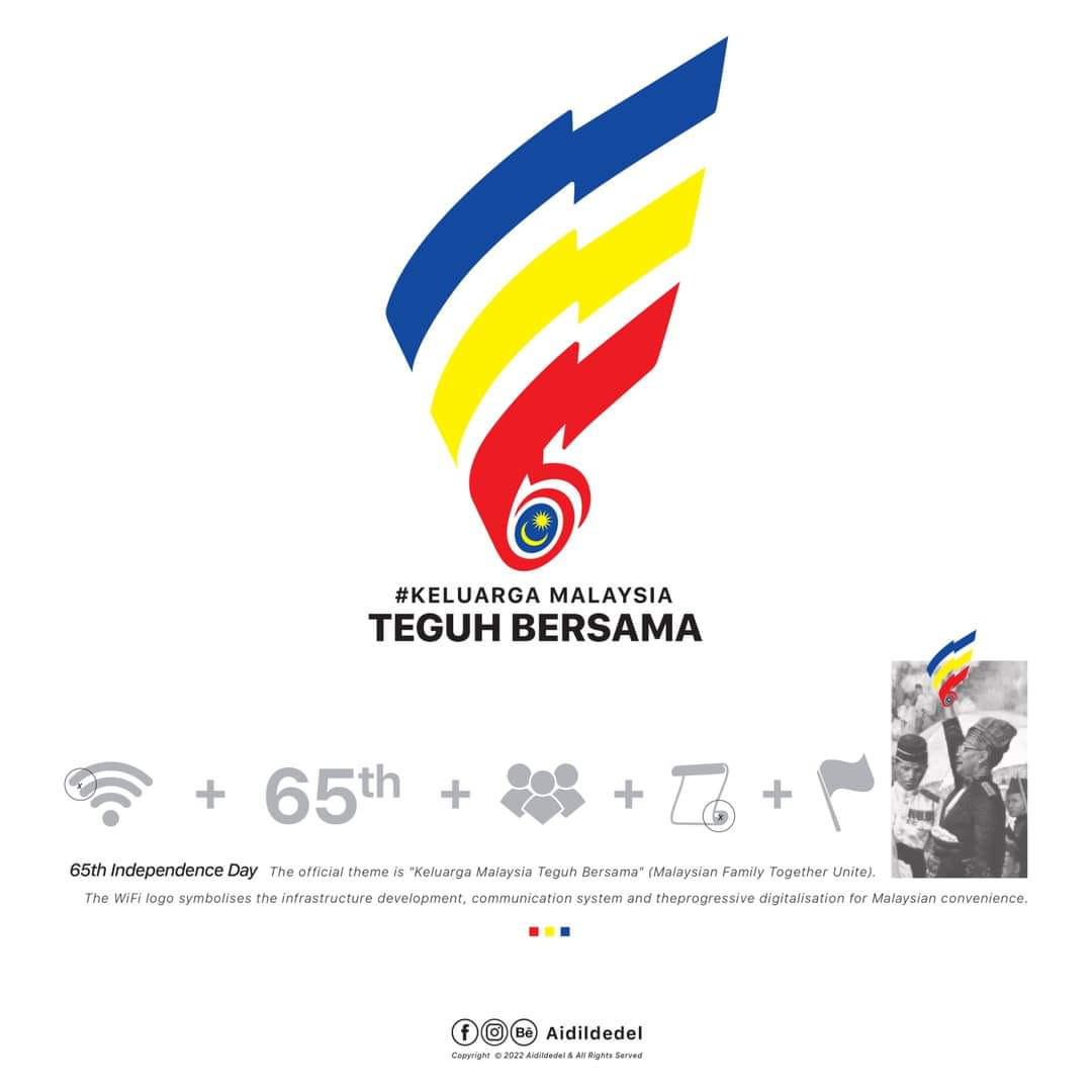
Reactions have been far more positive in comparison, with many saying that De Del’s redesign is more reflective of the nation’s history and culture, in addition to it’s future prospects with regards to enhanced connectivity.
![]()
“This is what we want.”
![]()
![]()
“Now this is really smart looking. Great work.”
![]()
What do you think?
For more stories like this, follow us on Facebook by tapping here!
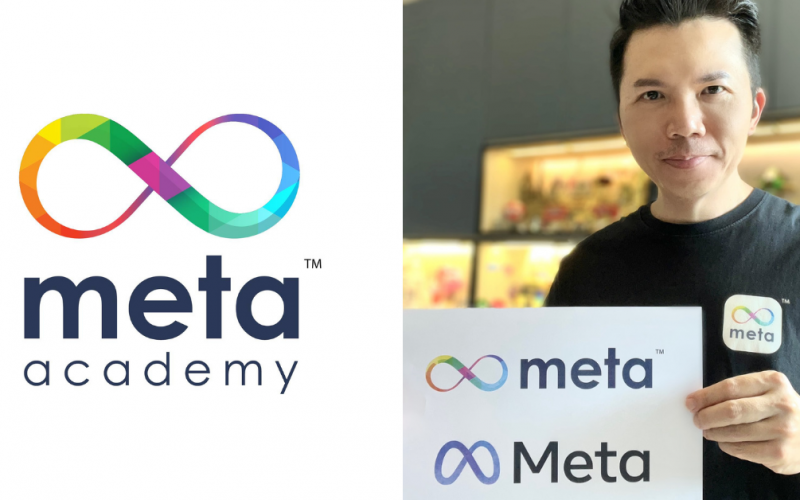
Also read: M’sian company Meta founded 3 years ago has similar name & logo with newly rebranded FB